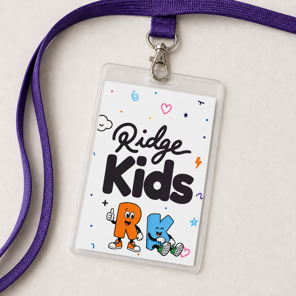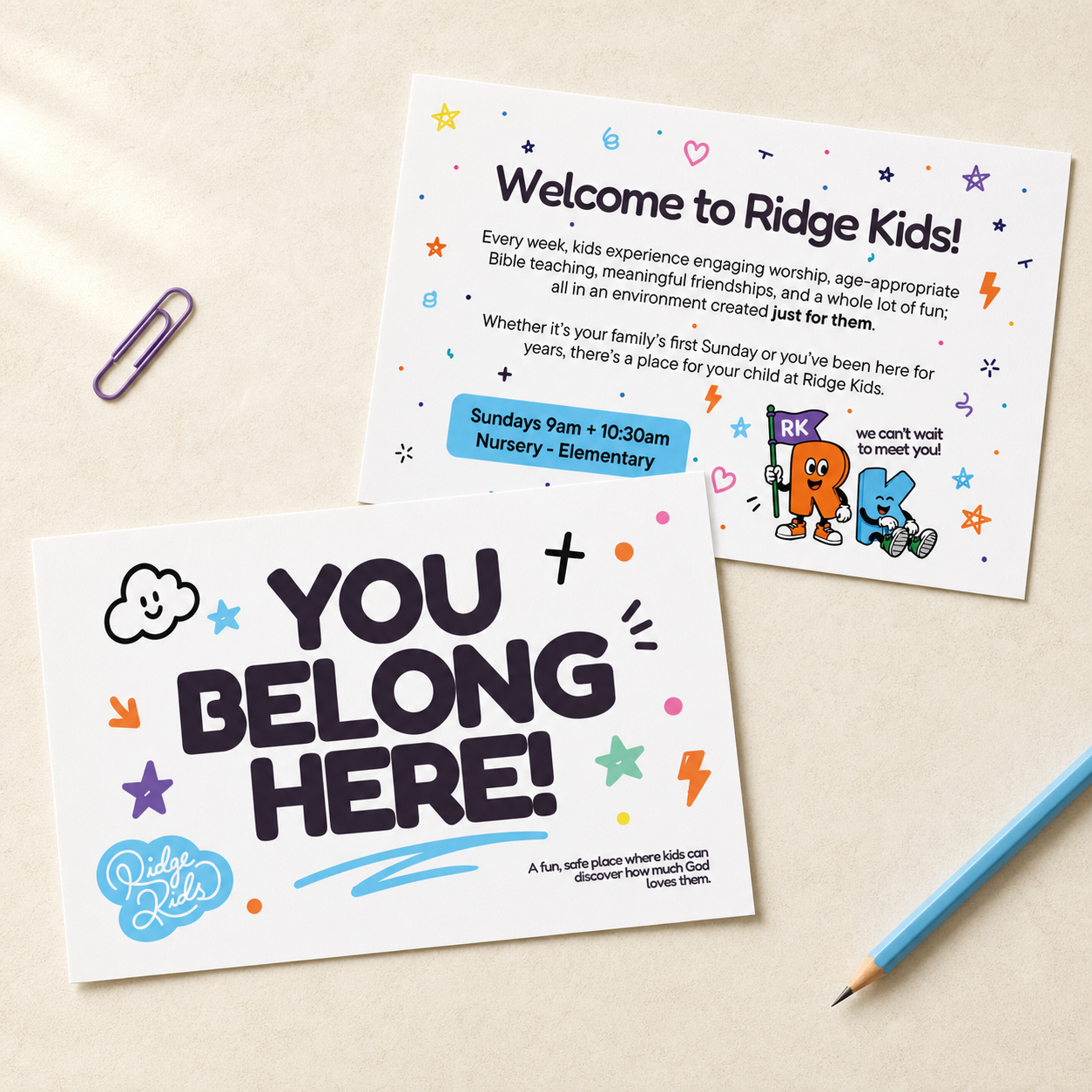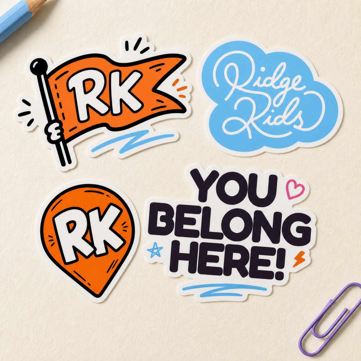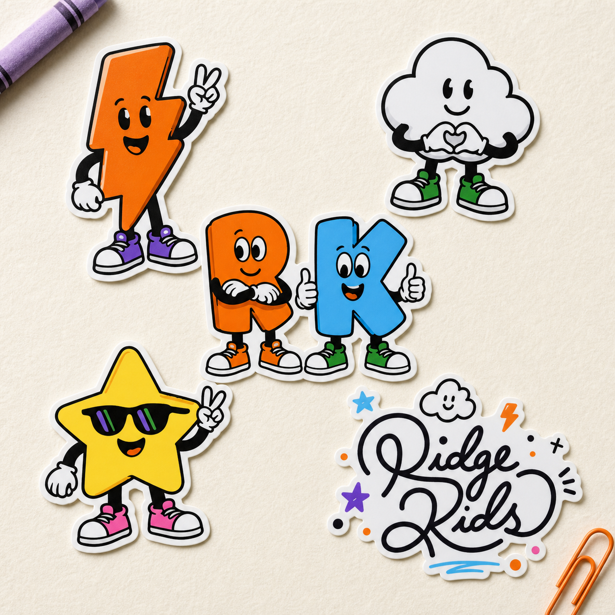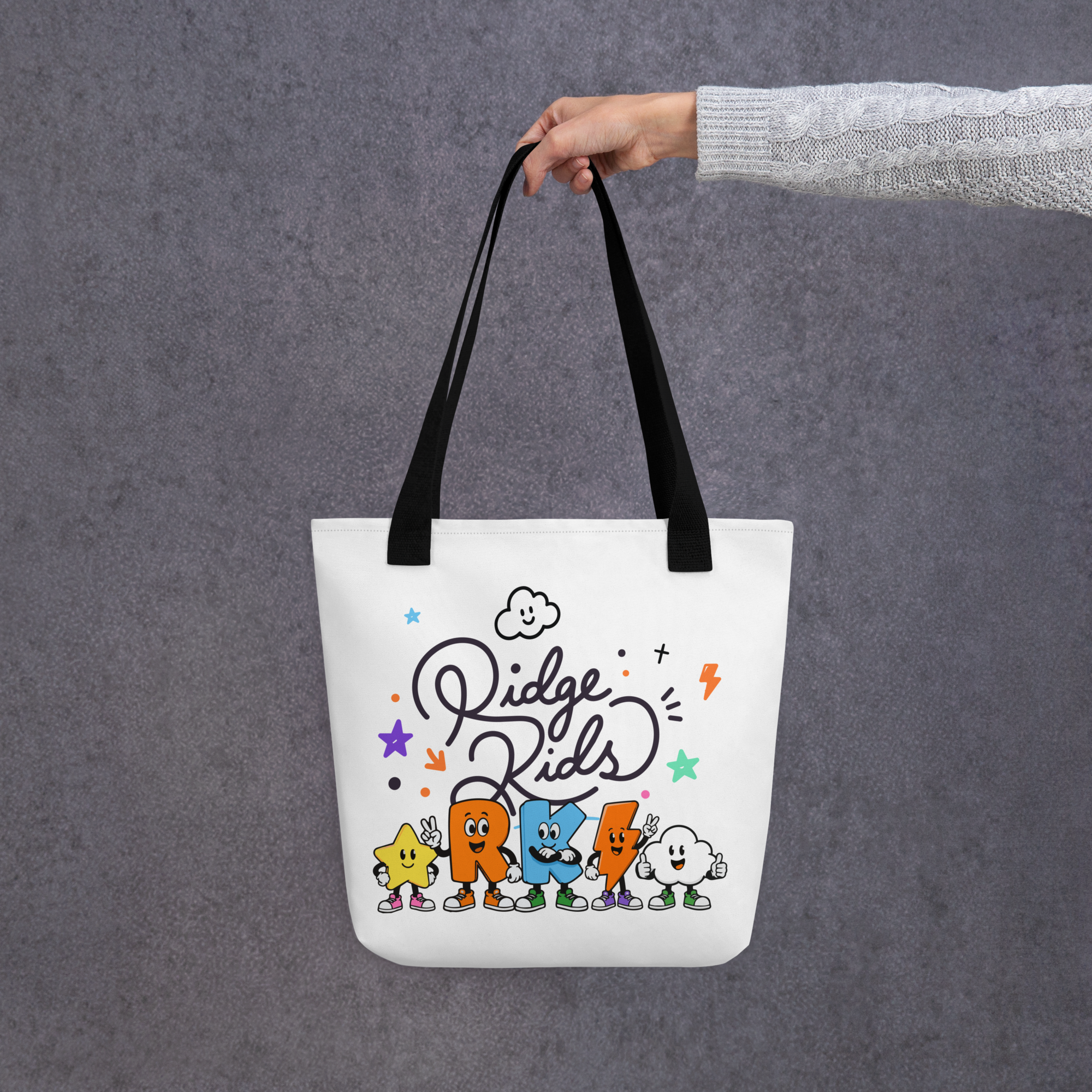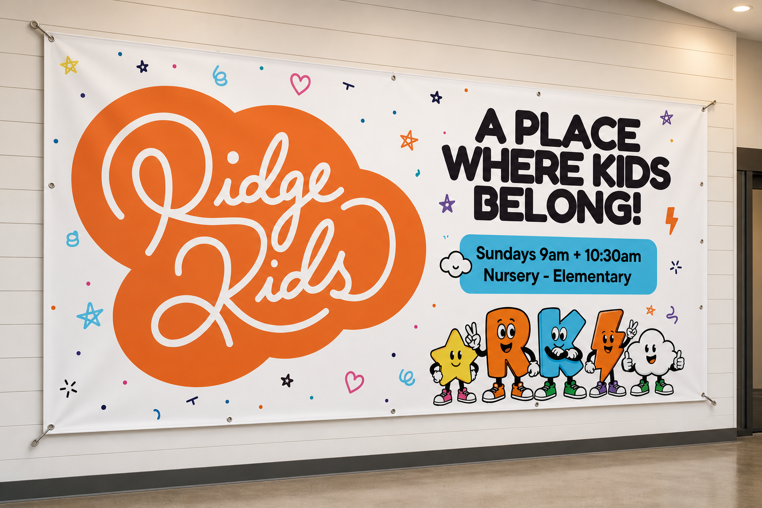
Ridge Kids needed an identity that felt energetic, playful, and unmistakably made for kids, without feeling overly childish or disconnected from the larger Southridge Church brand.
The new identity was built around bold typography, bright colors, playful shapes, and a pair of custom “R” and “K” characters that bring personality to the brand. From there, the system expanded into patterns, signage, apparel, environmental graphics, digital screens, and other touchpoints throughout the Ridge Kids experience.
The goal was to create more than a logo. It was to build a flexible visual world that could grow with the ministry, something fun enough for kids to connect with while still feeling polished, intentional, and recognizable to parents.