
The creative direction for this Easter campaign centered around one simple idea: new life.
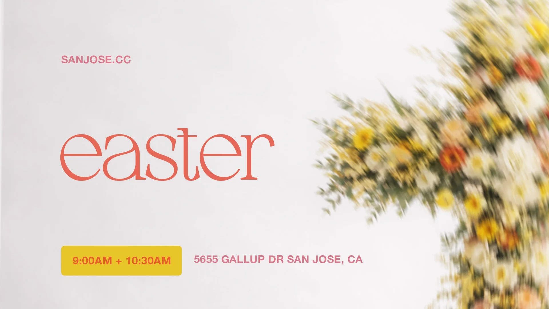
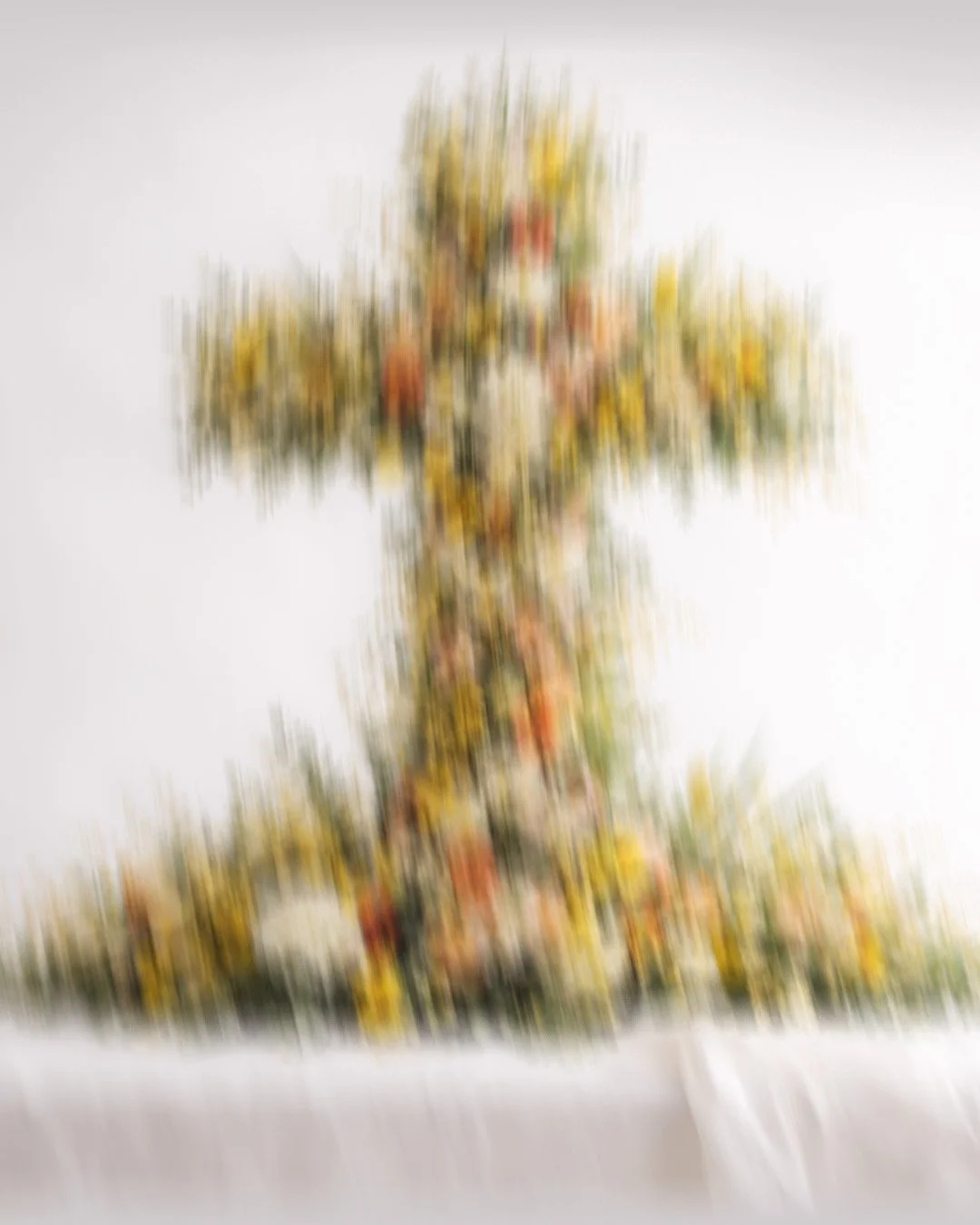
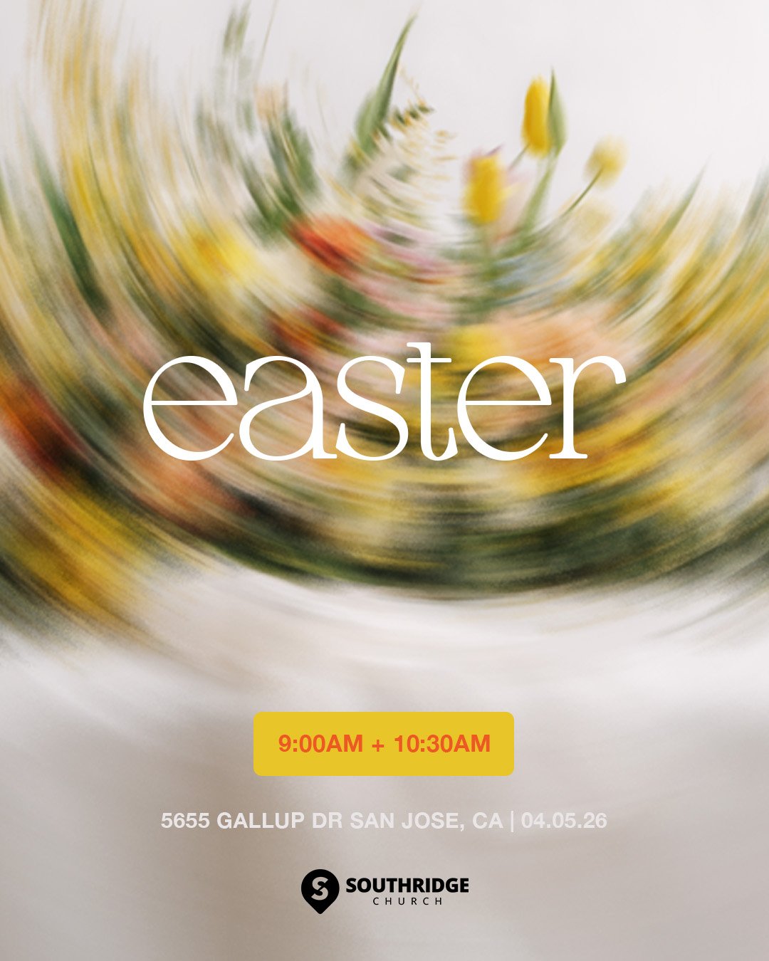
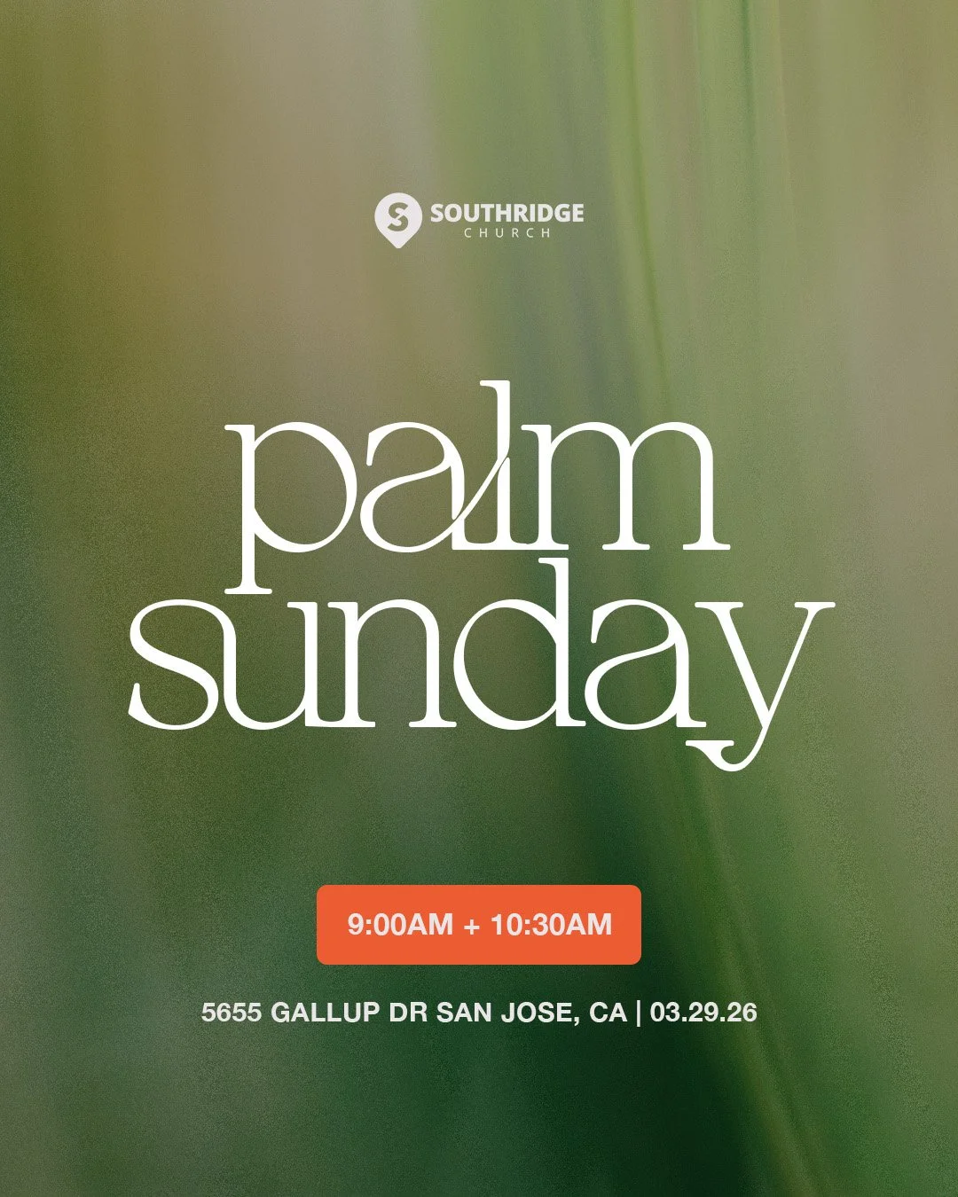
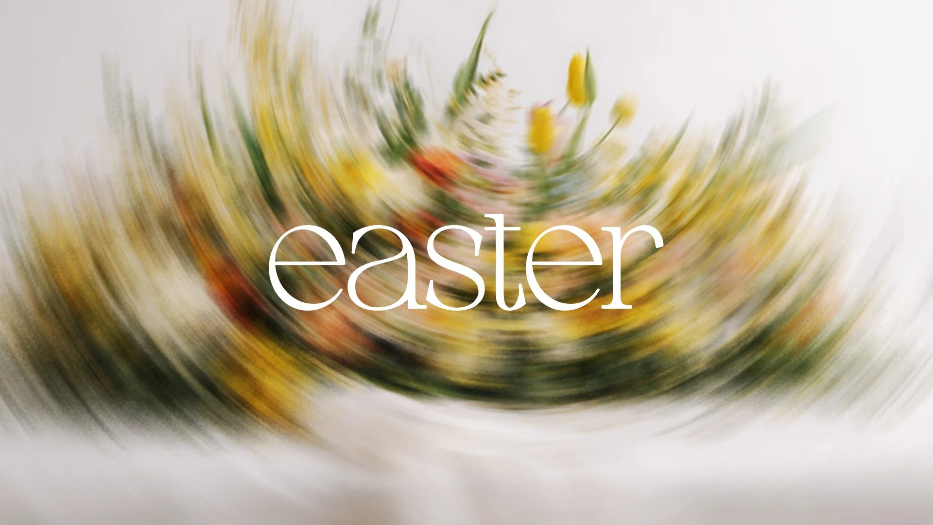
Rather than relying on traditional Easter imagery, the visual identity communicates the hope of the resurrection through blooming flowers, vibrant color, and intentional movement. The floral arrangements symbolize life emerging where there once was death, while the soft motion blur introduces a sense of energy, renewal, and celebration, as if creation itself is coming alive.
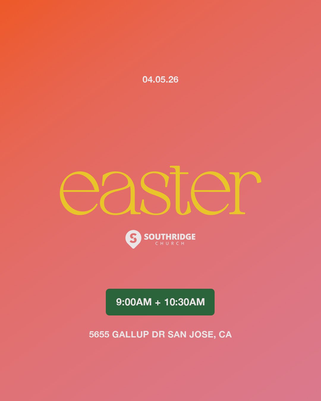
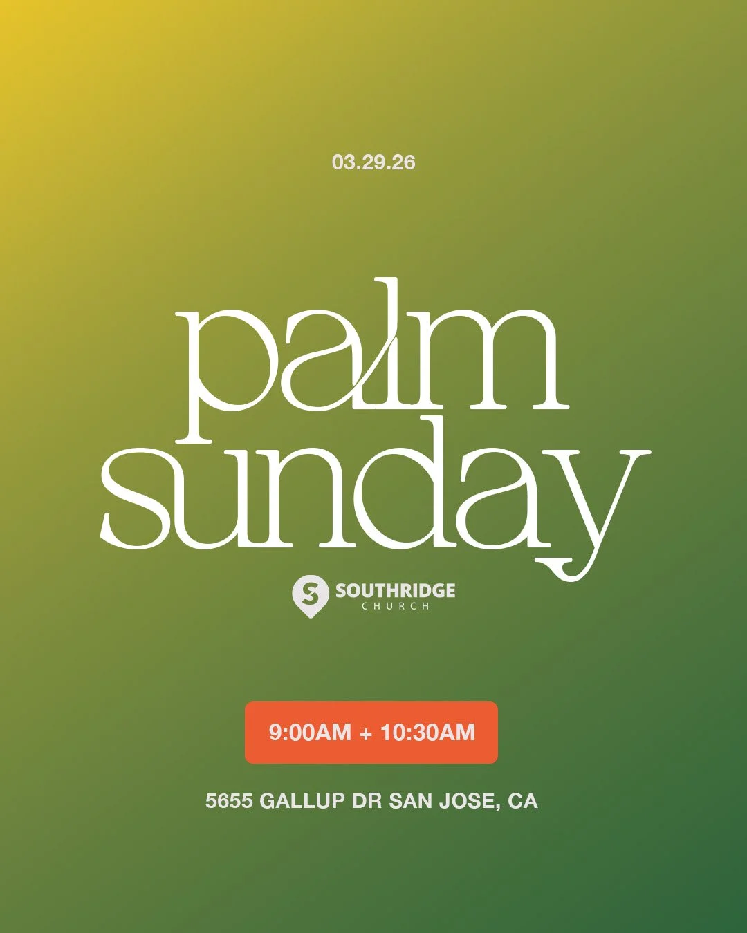
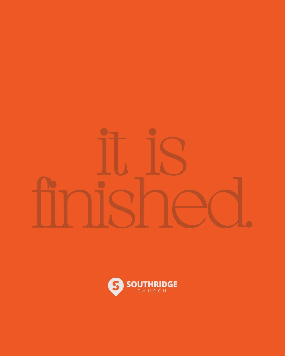
Typography was kept elegant and understated, allowing the imagery to carry the emotional weight of the campaign. The oversized serif type creates a refined, timeless presence that complements the organic beauty of the florals without competing for attention.
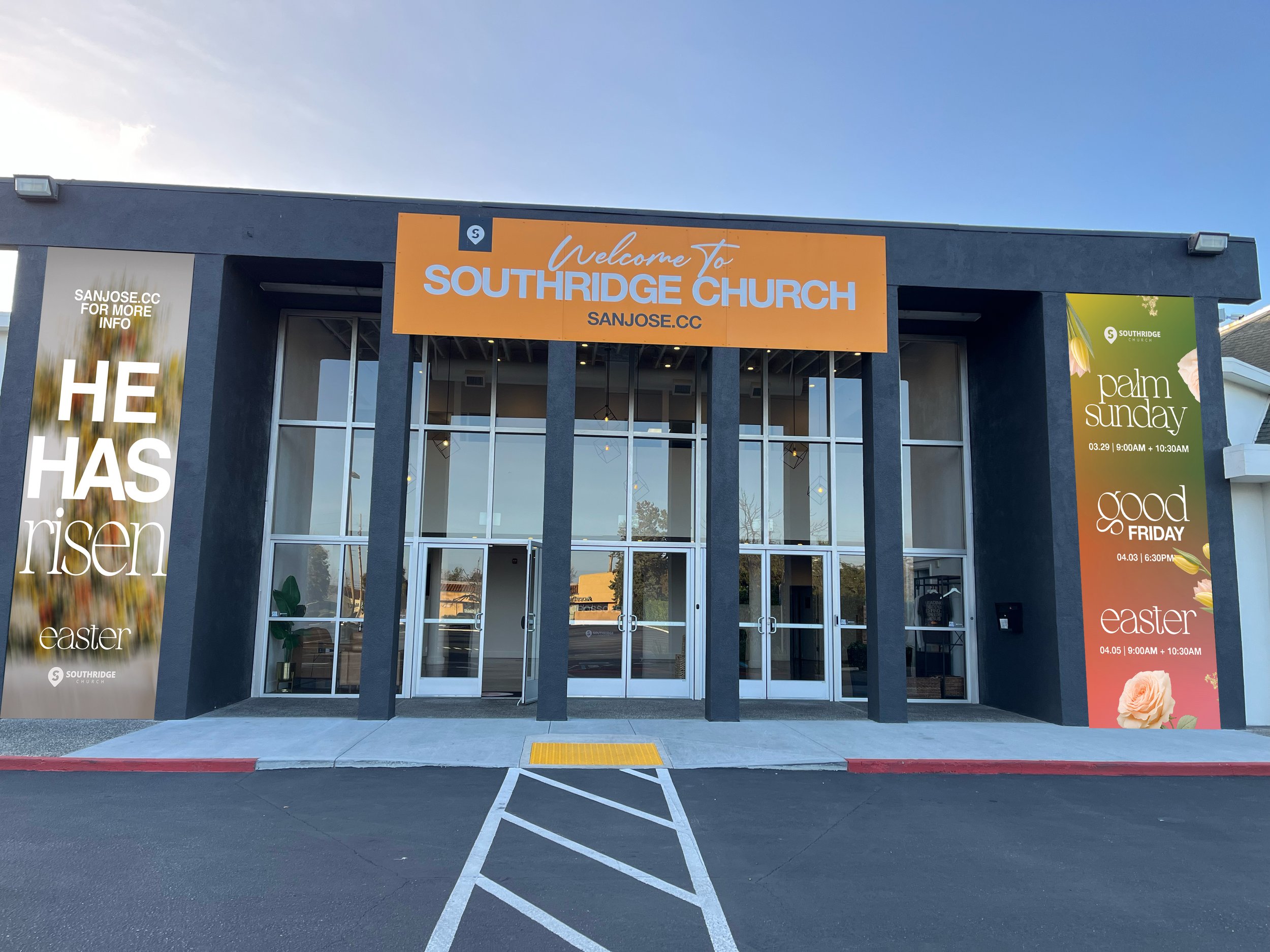
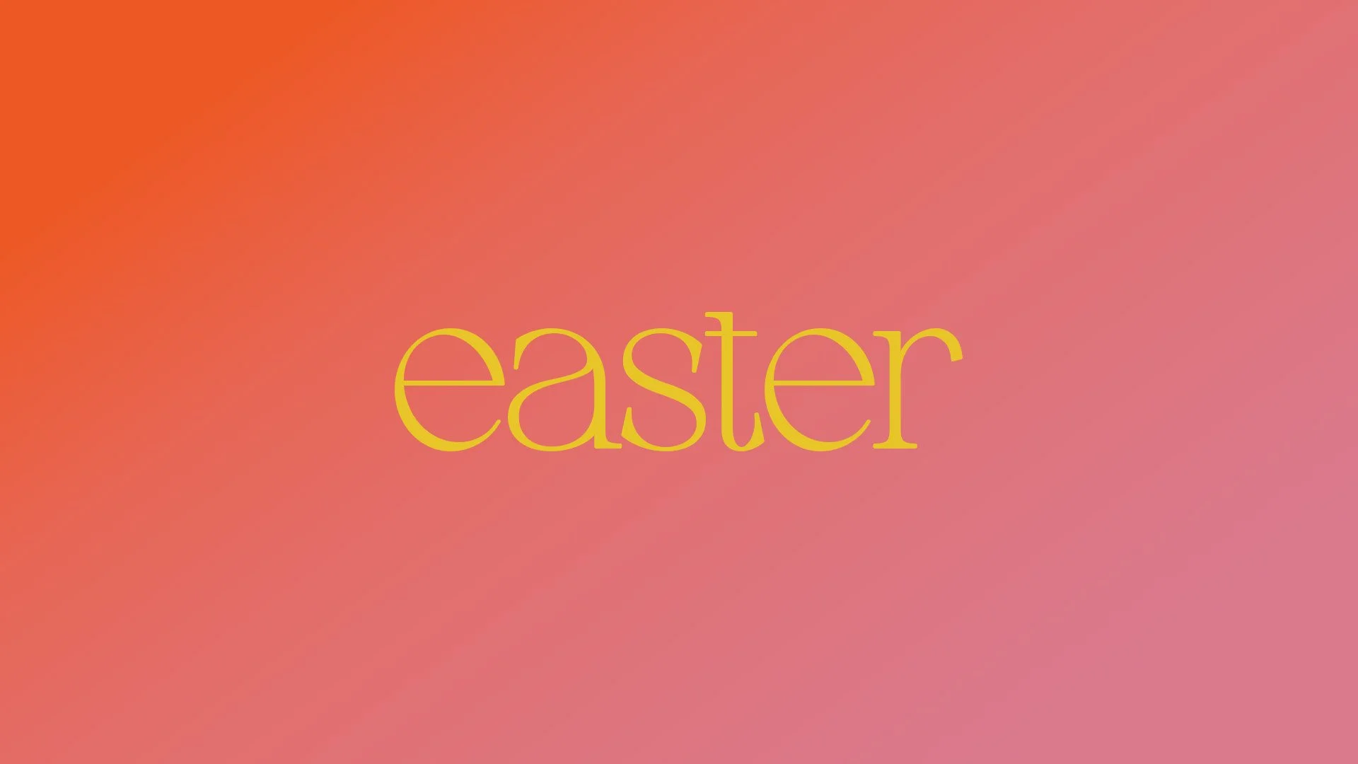
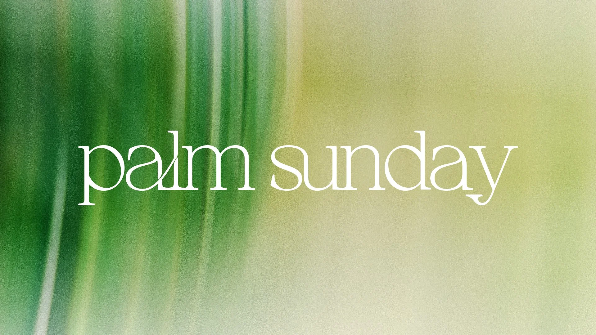
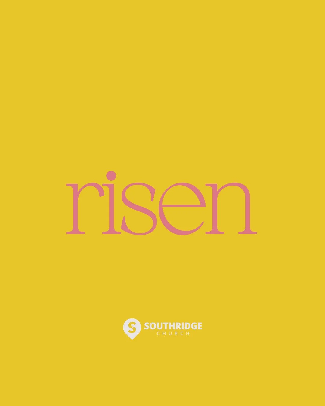
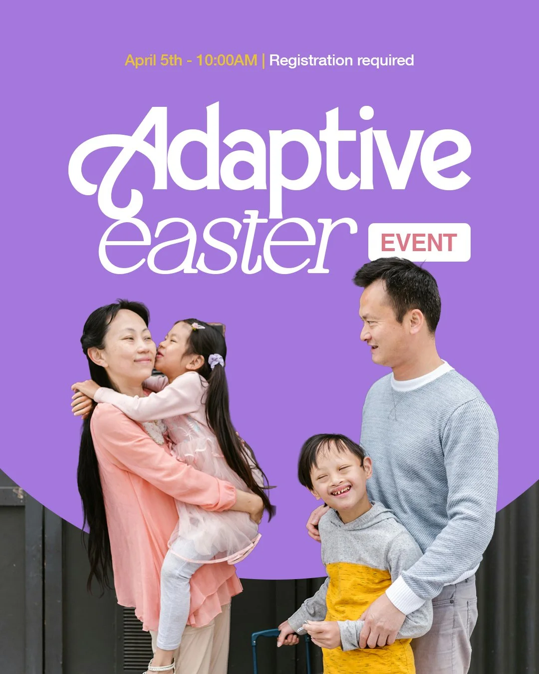
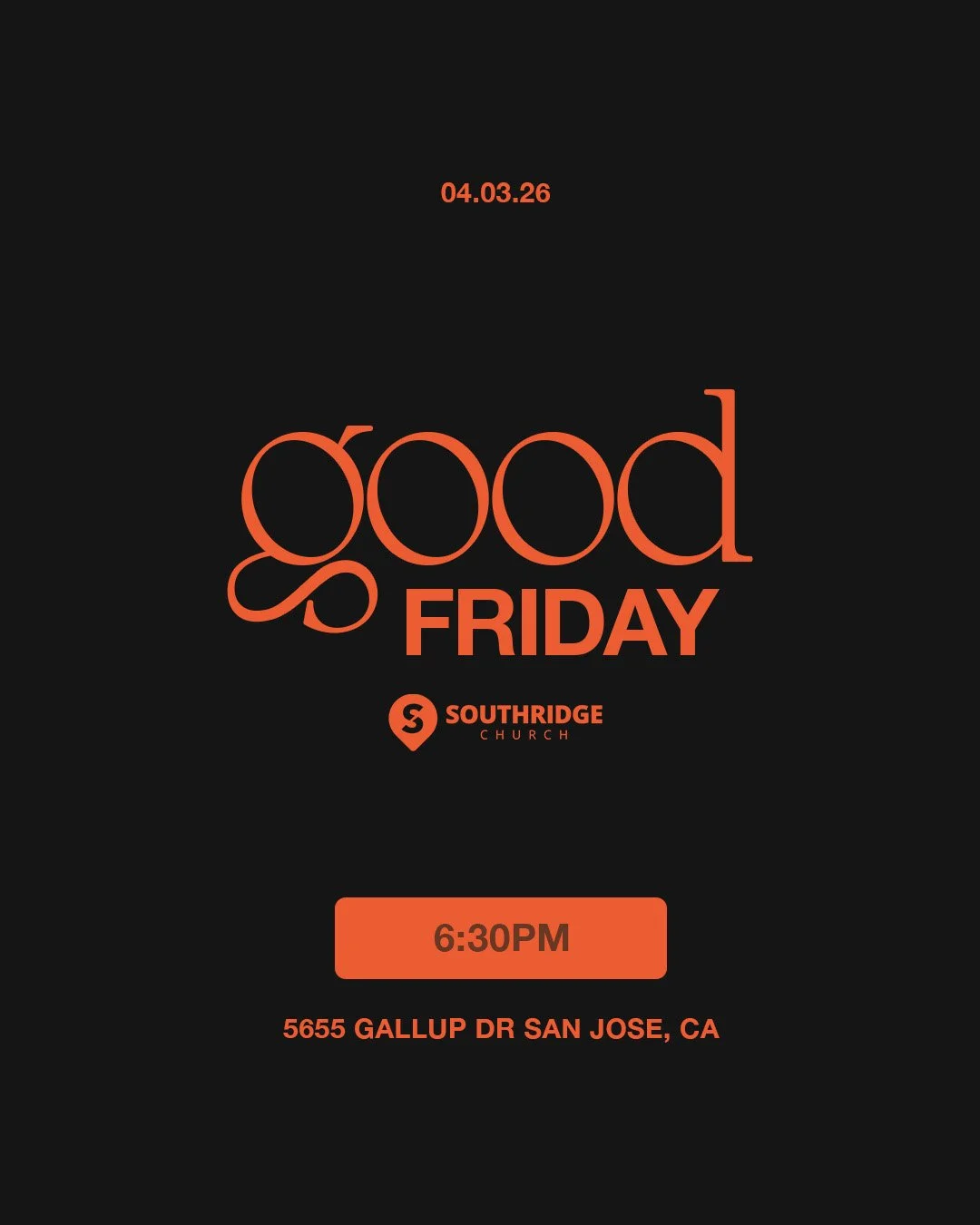
The supporting graphics extend the visual system across Palm Sunday, Good Friday, Easter, and post-Easter messaging through a carefully curated color palette. Each day receives its own distinct color and personality while remaining unmistakably part of the same campaign. This creates variety across social media, print, and digital environments while reinforcing a cohesive visual identity throughout the Easter season.
The overall design intentionally balances modern minimalism with warmth and joy. Large areas of negative space give the artwork room to breathe, allowing the vibrant imagery and typography to feel impactful without becoming overwhelming.
Ultimately, the campaign was designed to capture the feeling of Easter rather than simply illustrate it. It communicates that because Christ is risen, everything changes. New life begins, hope is restored, and what once seemed lifeless blooms again.