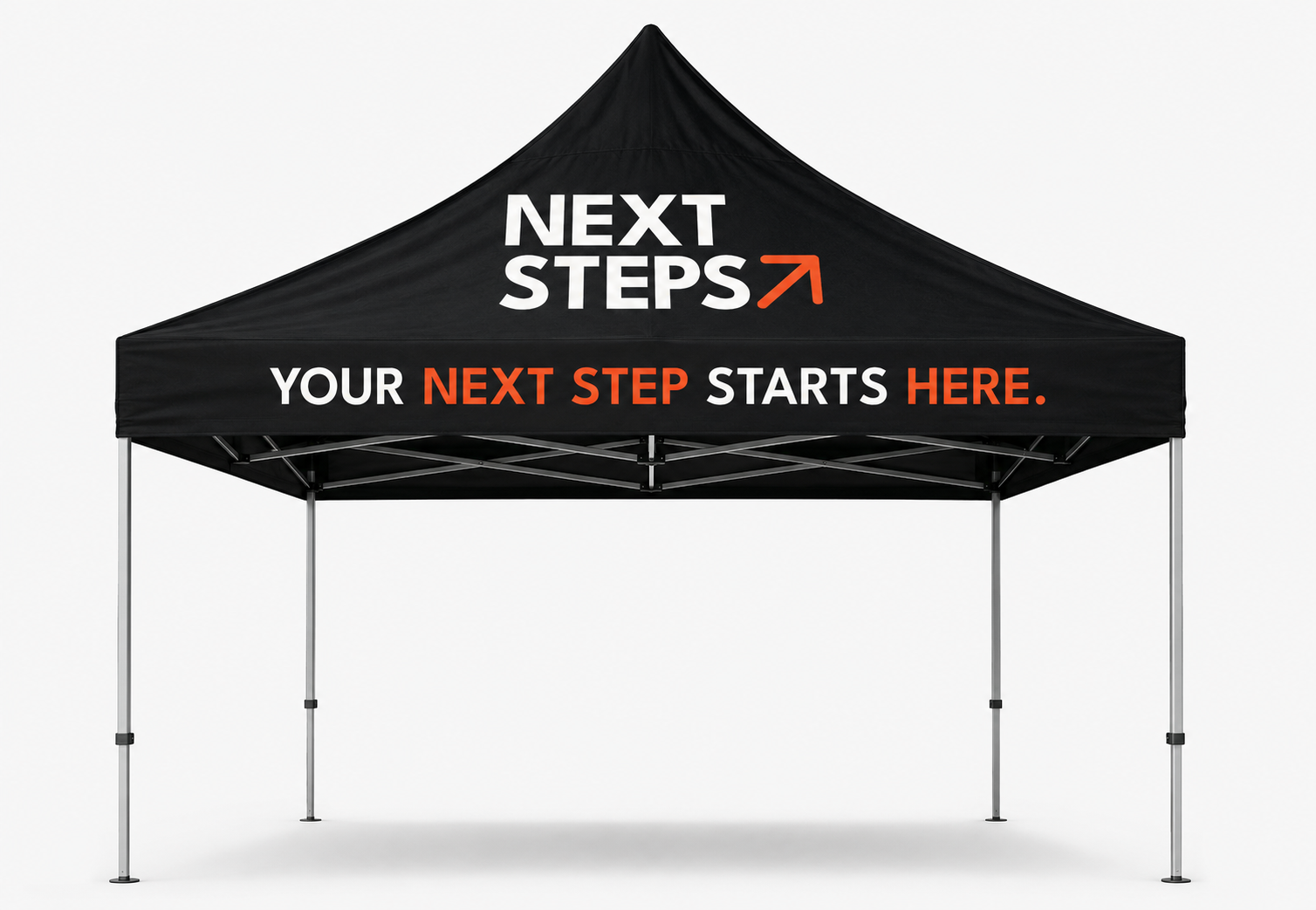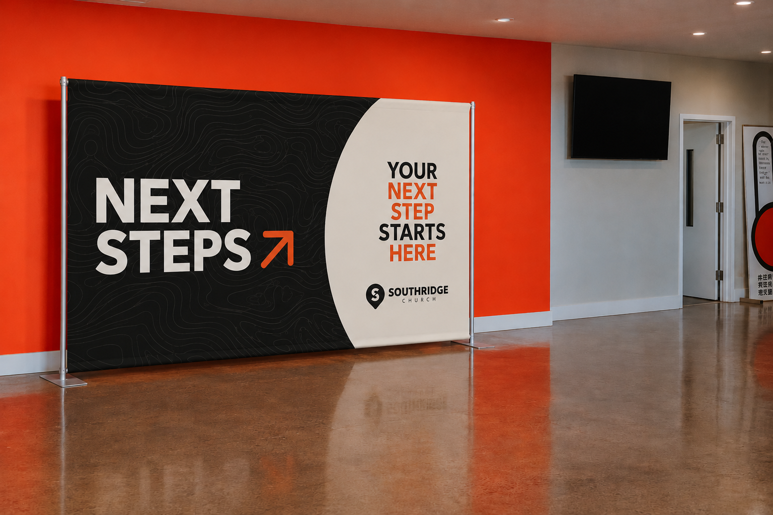


The goal of the Next Steps brand was to create more than a ministry logo.
It was to build an identity that communicates movement, growth, and intentional discipleship throughout every touchpoint of the church.
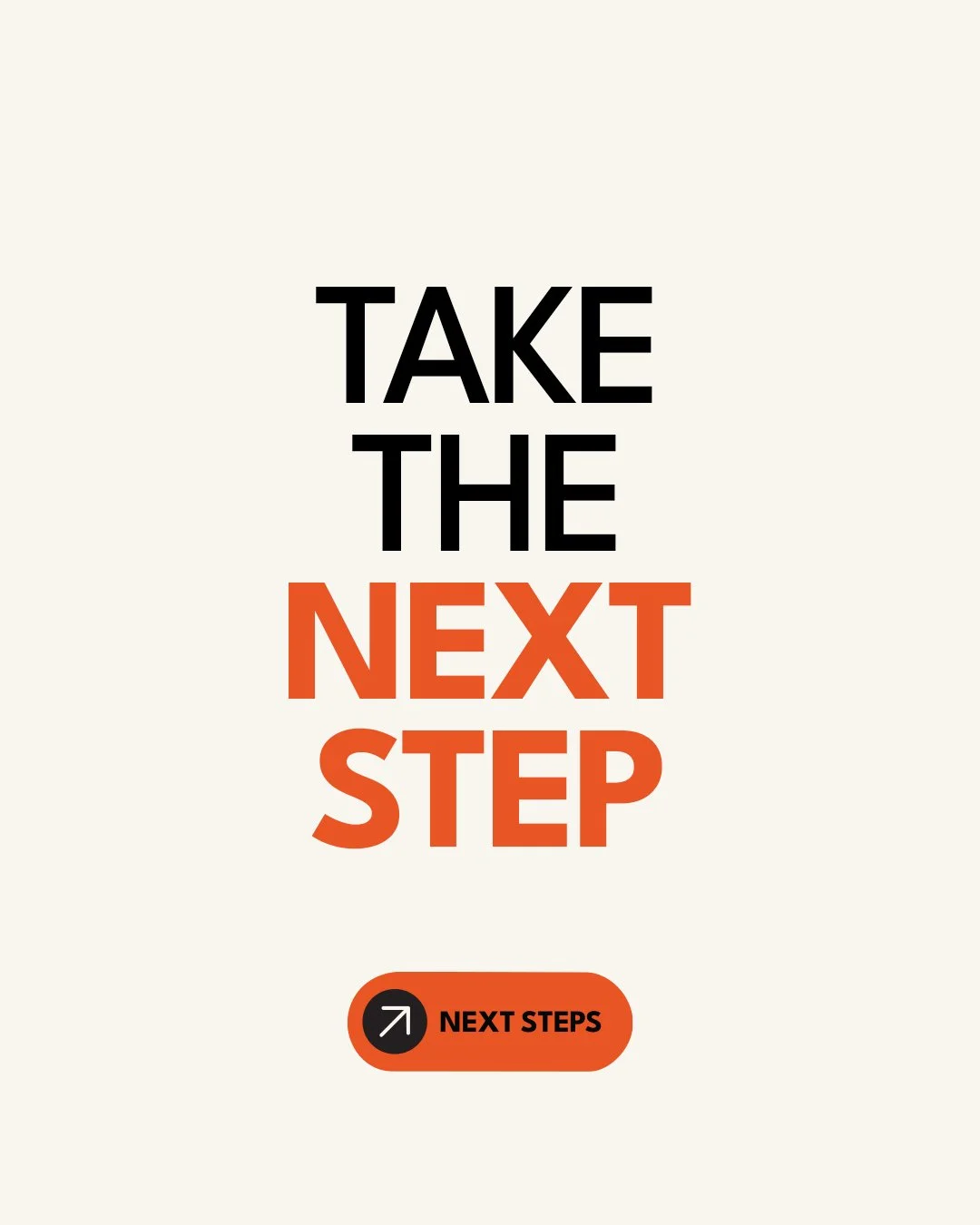
At the center of the system is a simple upward arrow. More than just an icon, it becomes a visual metaphor for spiritual growth, momentum, and taking the next step in one's faith journey. That symbol serves as the foundation for an entire brand language, appearing consistently across signage, environmental graphics, print materials, apparel, and digital experiences to create instant recognition.
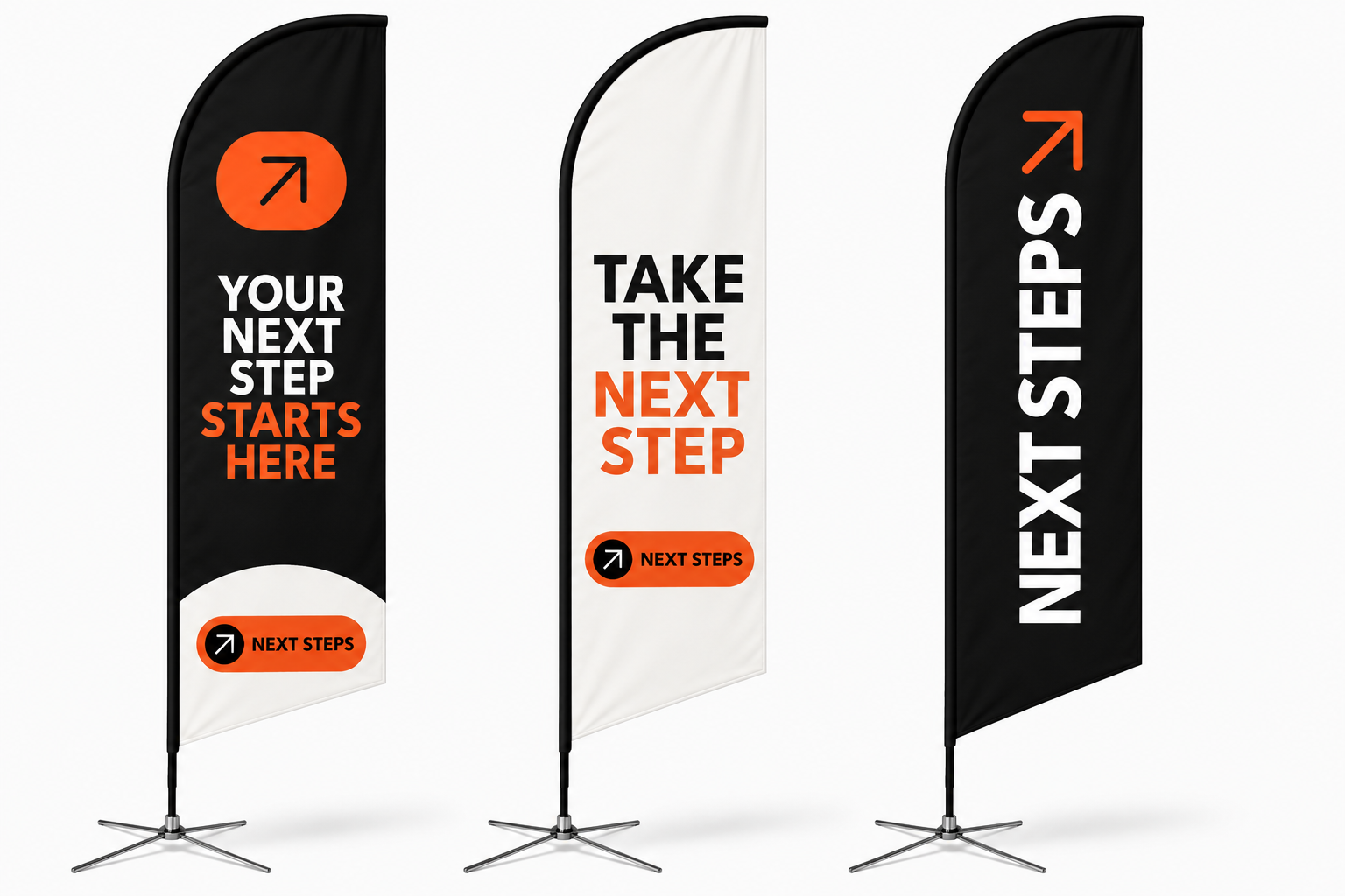
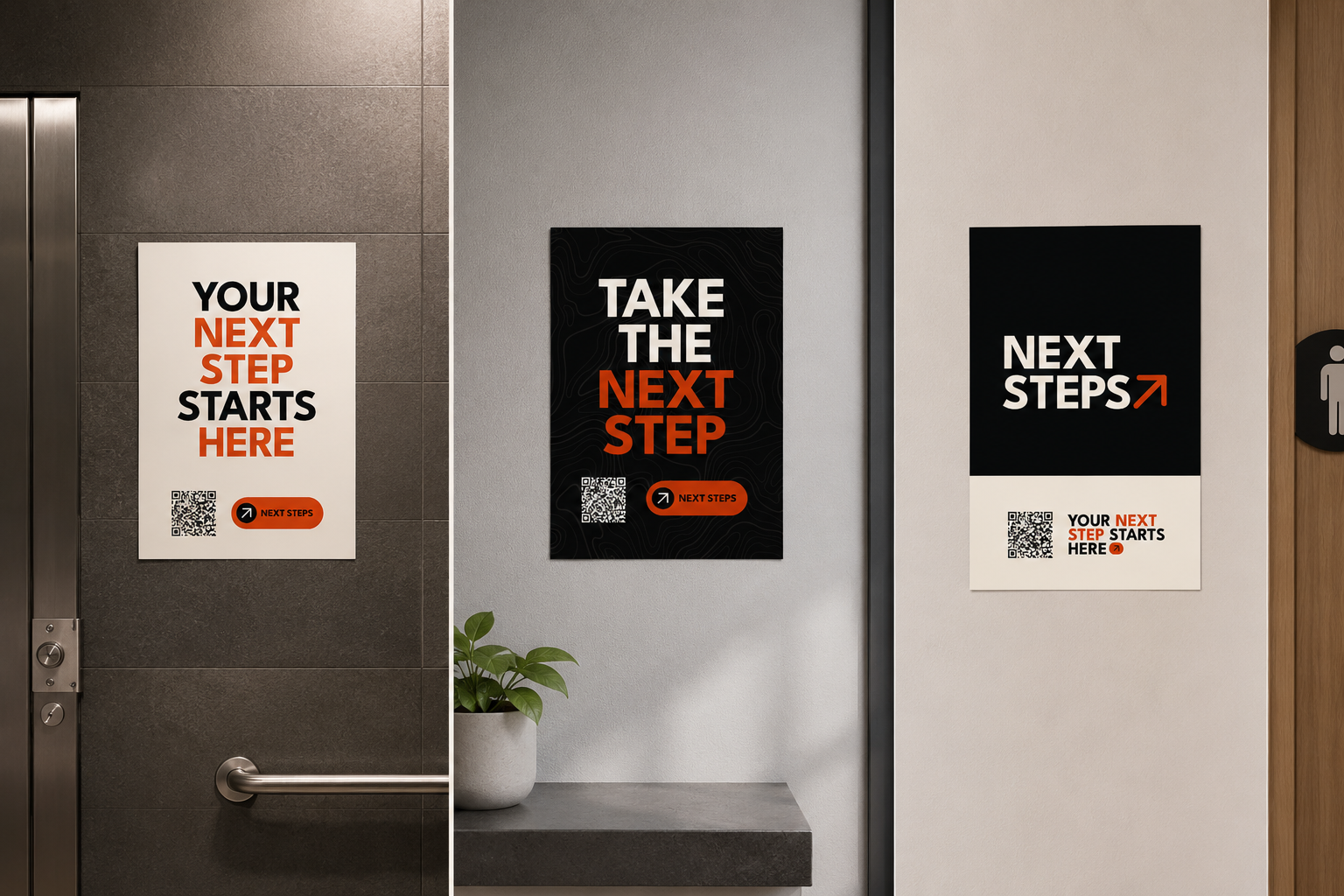
The visual system embraces bold typography, generous negative space, and a restrained color palette of black, cream, and Southridge's signature orange. The high contrast ensures exceptional readability in busy environments while giving the brand a confident, modern presence that feels both approachable and memorable.
Rather than creating isolated pieces, every application was designed as part of a scalable system. Directional signage, event banners, lobby displays, promotional posters, feather flags, and ministry resources all share the same visual DNA while adapting to their specific purpose. This consistency allows the brand to guide people through physical spaces as naturally as it communicates online.
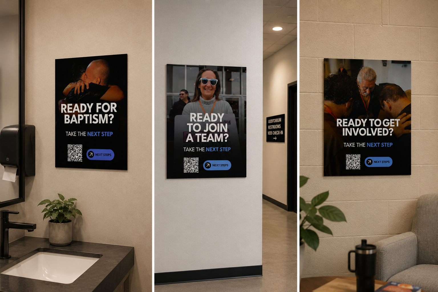
Photography plays a key role in reinforcing the message. Real moments of baptism, serving, prayer, and community replace generic imagery, reminding people that "Next Steps" isn't simply a program, it's about real people taking meaningful steps in their relationship with Christ.
The flexibility of the identity also allows for expansion through supporting colors and messaging. While orange remains the primary action color, secondary colors help organize different ministries, events, and milestones without sacrificing brand consistency. This creates a system that is both structured and adaptable as the ministry continues to grow.
Ultimately, the Next Steps brand was designed to remove friction and create clarity. Every arrow, sign, banner, and environmental element points people toward action, transforming the church campus into a space that naturally encourages movement, participation, and spiritual growth.
Rather than simply telling people to take a next step, the brand itself becomes a visual invitation to begin the journey.