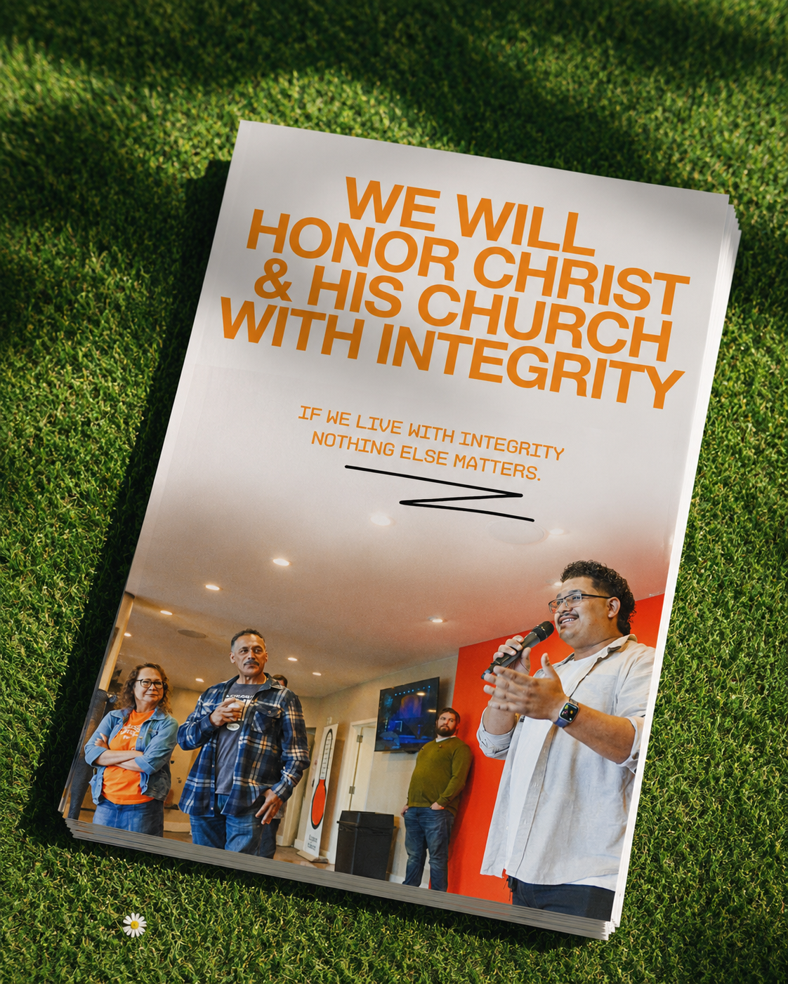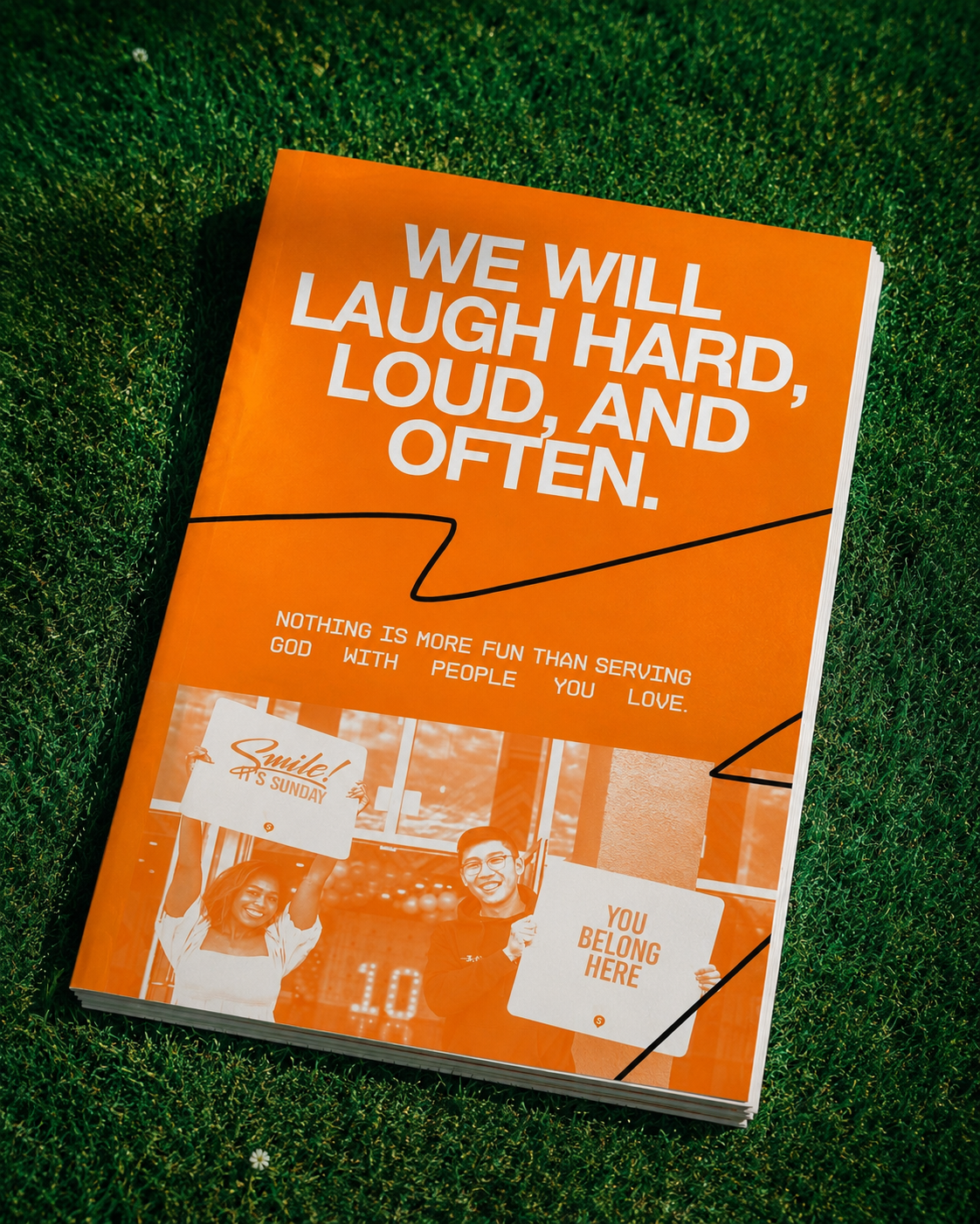

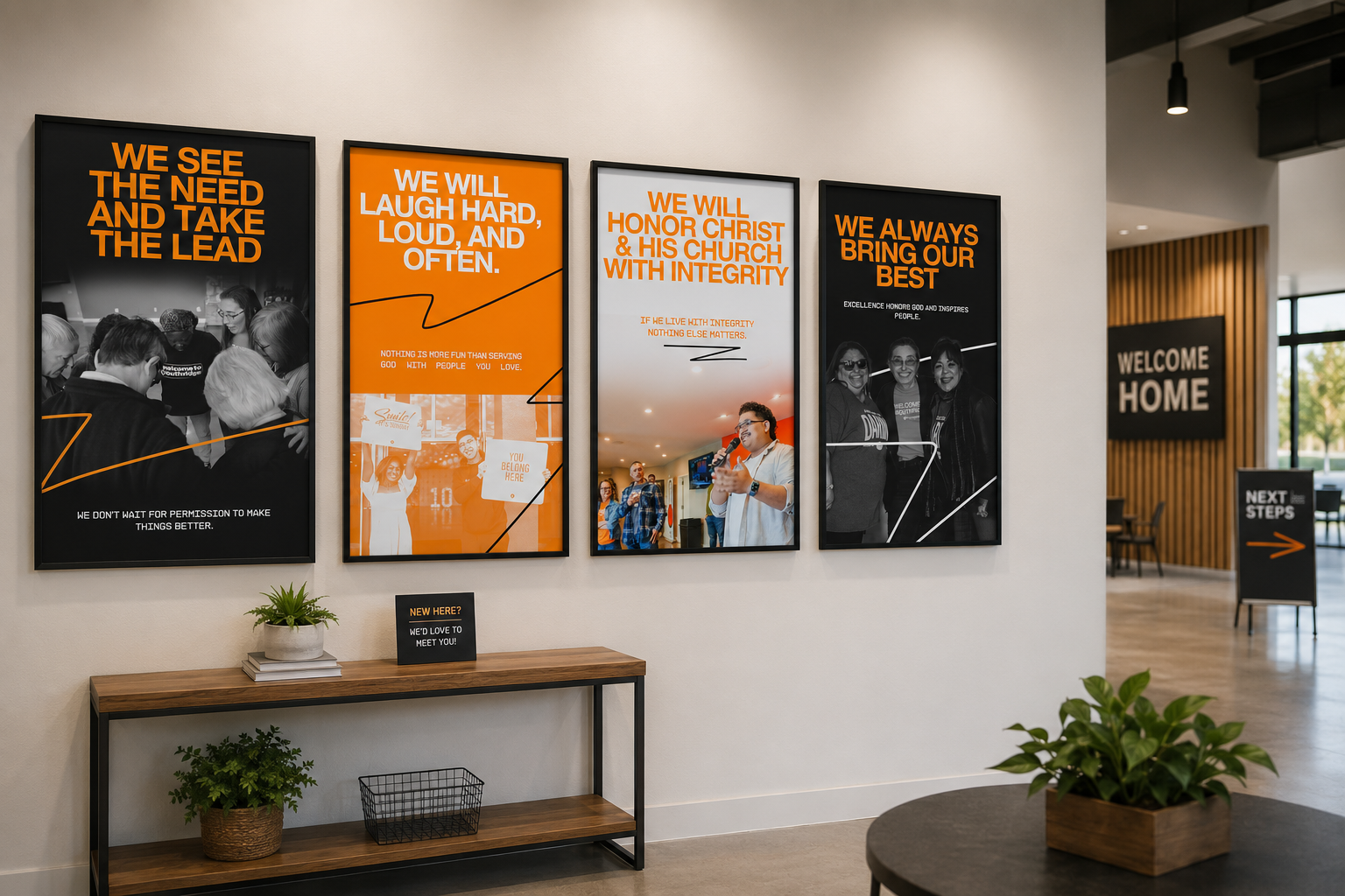
The goal of this series was to transform Southridge's core values into something more than wall art, to create a visual expression of the culture that defines the church.
Each poster was intentionally designed to stand on its own while still functioning as part of a unified system. Rather than repeating the same layout four times, every piece introduces its own composition, imagery, and balance of color, giving each value its own personality. At the same time, a consistent typography system, color palette, graphic linework, and spacing create a cohesive collection that feels connected when displayed together.
To make the values feel authentic rather than aspirational, each poster incorporates photography of real people from Southridge. Instead of using stock imagery, the designs celebrate the church's own community, reinforcing that these values are already being lived out by the people who call Southridge home.
The bold typography ensures each statement can be read from a distance, while the clean layouts and modern graphic elements keep the series feeling fresh, creative, and timeless. The result is a collection that communicates culture at a glance—inviting both first-time guests and long-time members to immediately understand what Southridge is about.
Rather than simply decorating a wall, these posters were designed to reinforce identity. They remind everyone who walks through the doors not only what Southridge values, but who Southridge strives to be.